Case Study
Enterprise Data Analysis
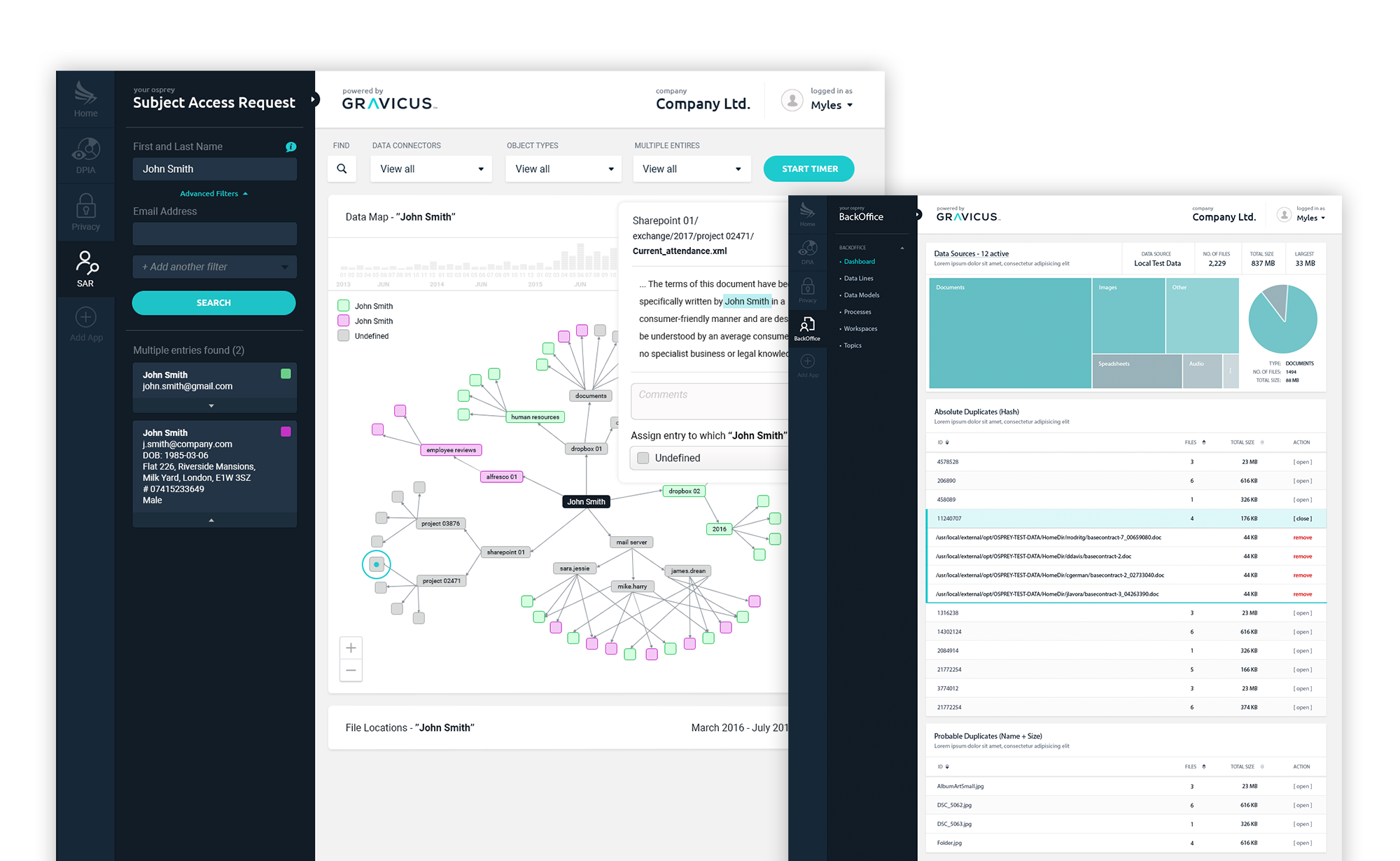
Gravicus provides businesses with dynamic data management tools using a multitude of AI capabilities (e.g. machine learning and natural language processing) to search, analyse and organise data rapidly for protection, compliance and insights.
Location
On-site, Remote
Services
Data Visualization, UX/UI Design, ReactJS
Role
Head of Design (1 year, 7 months)
Background
The Story
Gravicus started in GDPR compliance and pivoted into enterprise data analysis. As Head of Design I owned the full lifecycle - research, wireframing, prototyping and high-fidelity UI through to dev handover. Alongside the product apps we ran the website, social and marketing materials too.
UX Design
User Experience
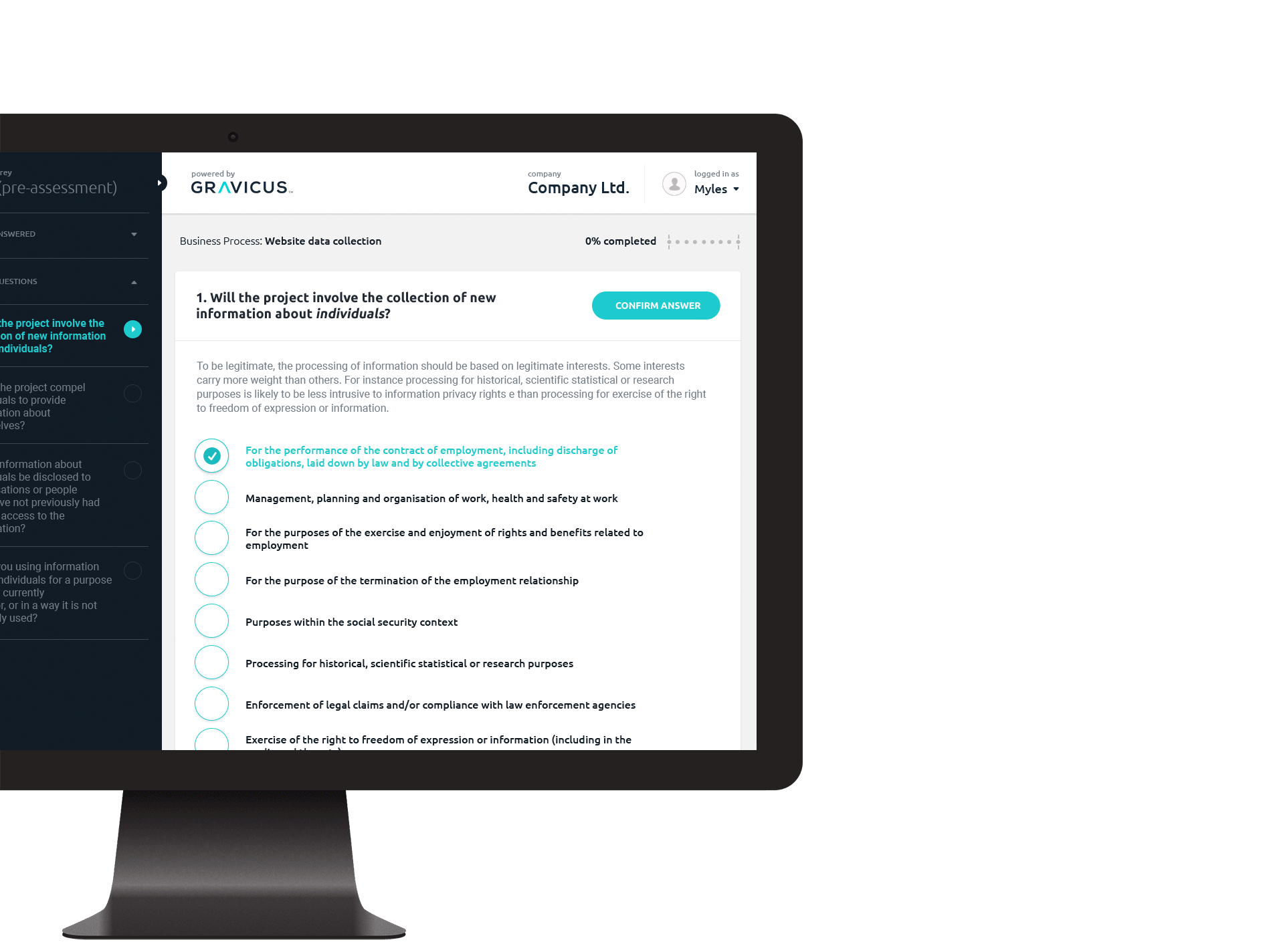
Planning was critical when building such complex data-intensive apps. I led the group through workshops and sticky sessions to correctly map out our approach. This was followed by wireframes and interactive prototype iterations, both designed in Axure. We often looped back to test direction with our team, stakeholders and at times select customers.
UI Design
User Interface
The upfront planning shaped the style guide that carried through every app in the platform.
I branded multiple apps across the platform - including some re-branding of work predating my arrival. I also worked with the front-end team on the React side, tidying legacy CSS and polishing through several release cycles.
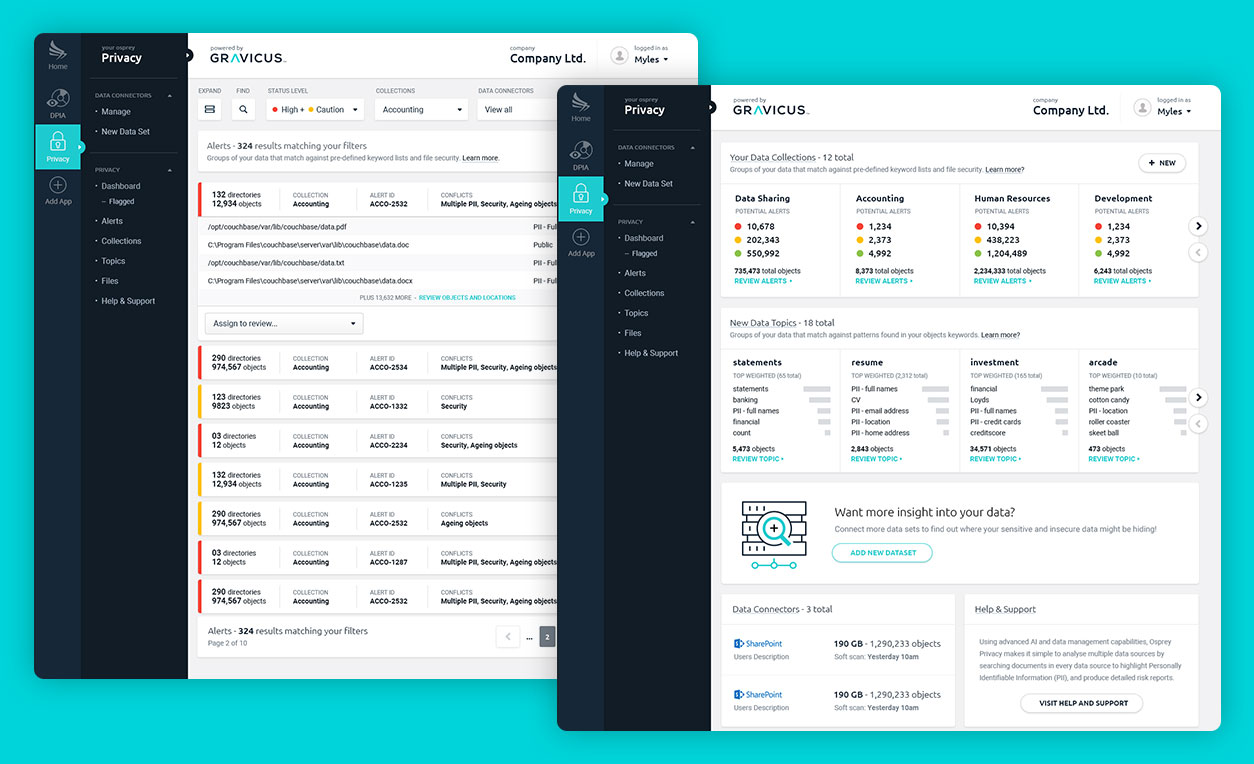
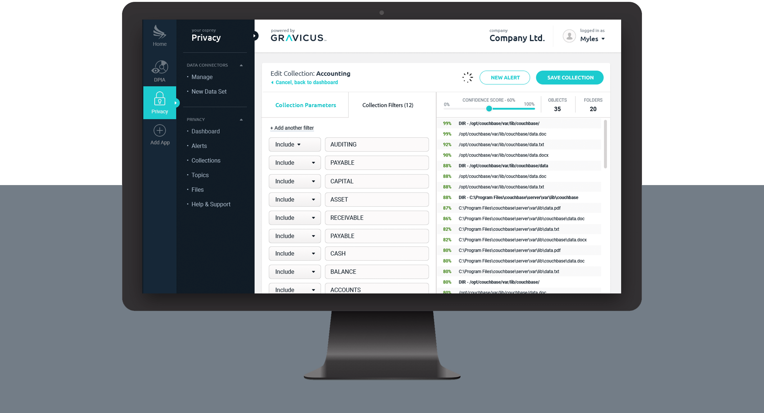
Collections
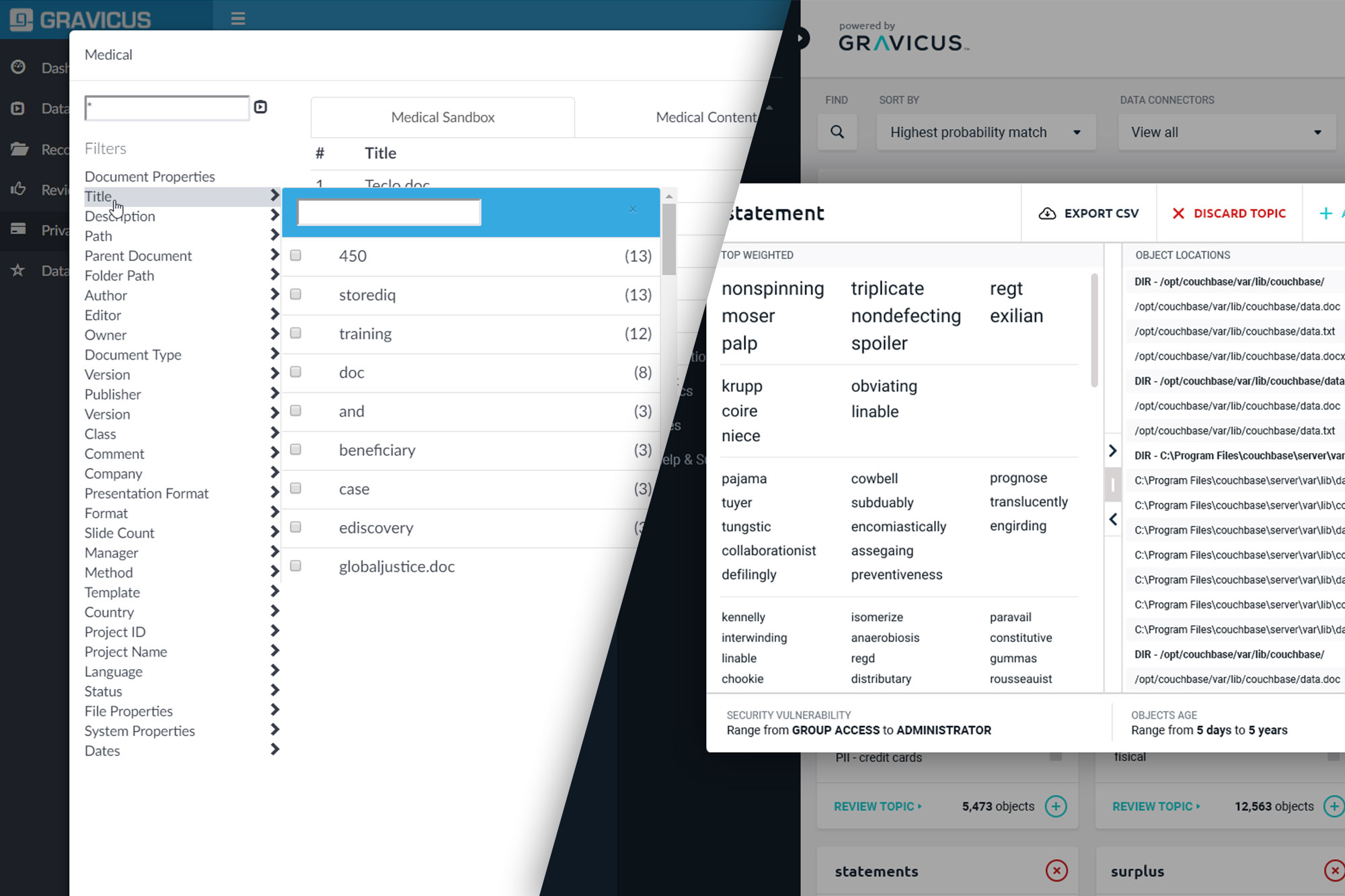
Once multiple data sets have been connected to the platform, users can then begin to customize collections based on a range of parameters to begin real-time analysis of their data.
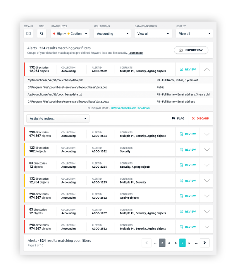
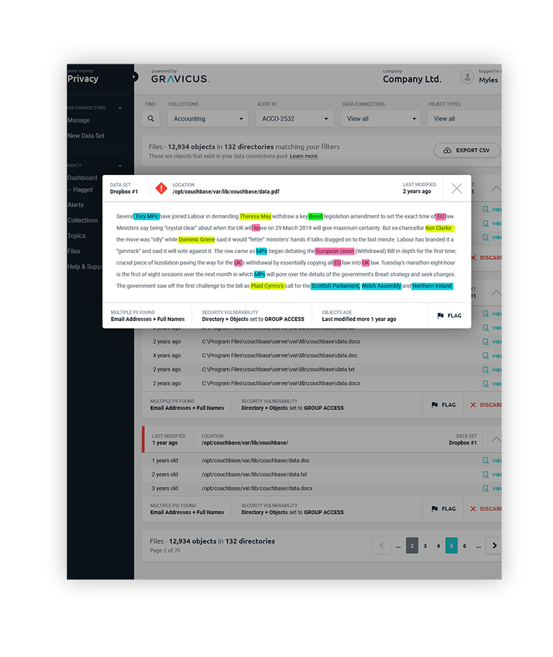
Data Alerts and Natural Language Processing
Once collections are active, the system acts similar to an anti-virus scanner to alert on potential data risk.
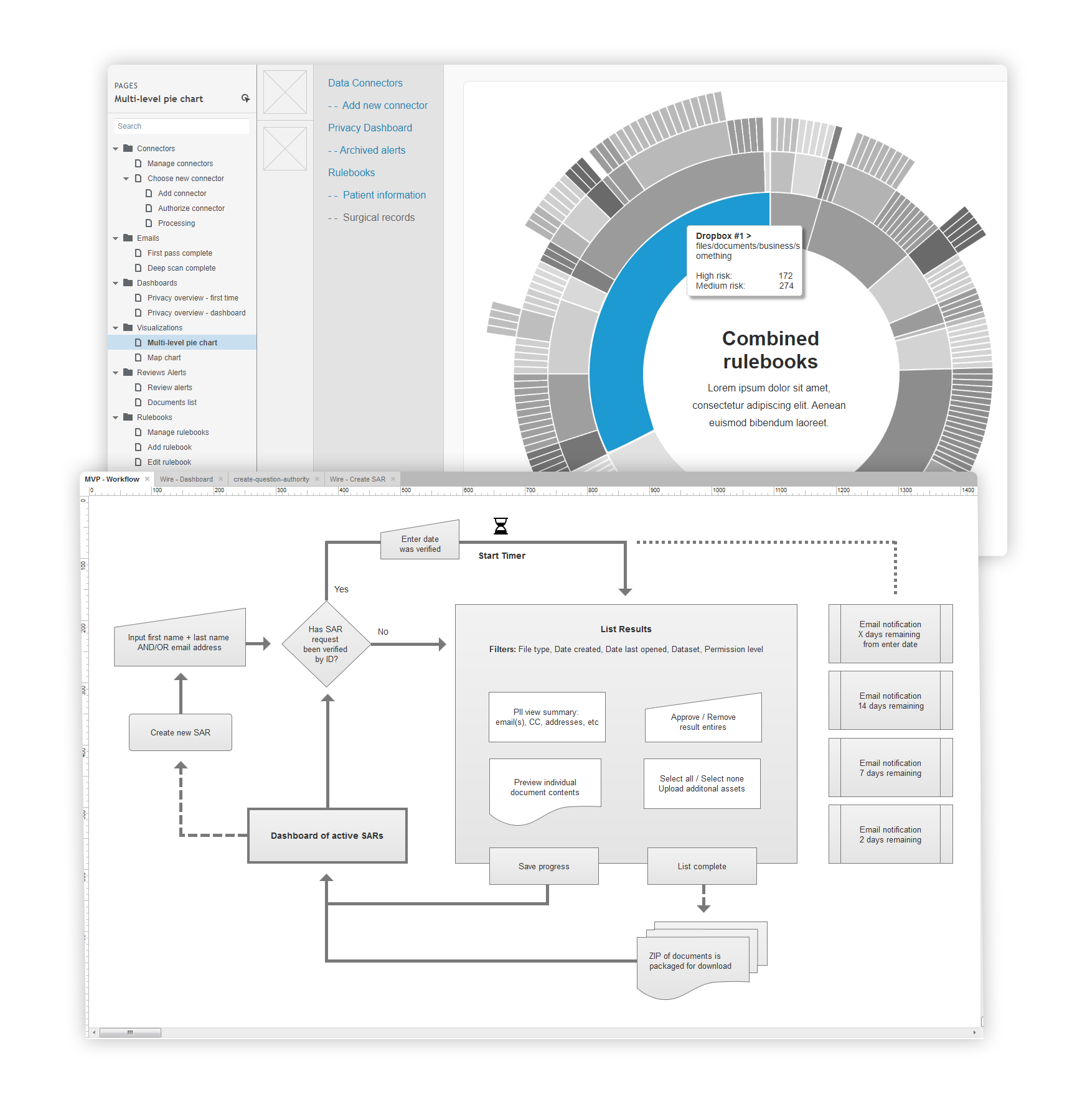
Visualization
We chose to go with React-Vis over D3.js for our front-end visual library. These are just a few of my favourite screens.
Outcome
Problem & Solution
The hardest part was visualising relationships between complex datasets in a way that non-technical users could actually work with. One view, multiple sources, no confusion.
Researching JavaScript visualisation libraries and their trade-offs was what made the difference early on. Getting that right at the start meant fewer surprises in the middle and cleaner deployments throughout.