
Case Study
Fintech Fund Platforms
Edgefolio is an award-winning B2B scale-up building platforms for cap intro and fund marketing teams, accelerating how capital actually gets raised.
Location
Remote, London
Services
UX/UI Design, Data Visualization, Service Mapping
Role
Senior Product Designer (2024)
Background
The Story
Edgefolio powers the unglamorous middle of fund distribution. Cap intro, fund marketing and the dashboards that sit between asset managers and the allocators they're trying to reach. I joined as Senior Product Designer to evolve the core fund-manager experience, sharpen the data story and tighten how front-end surfaces talk to the back-office tooling behind them.
Contribution
What I Did
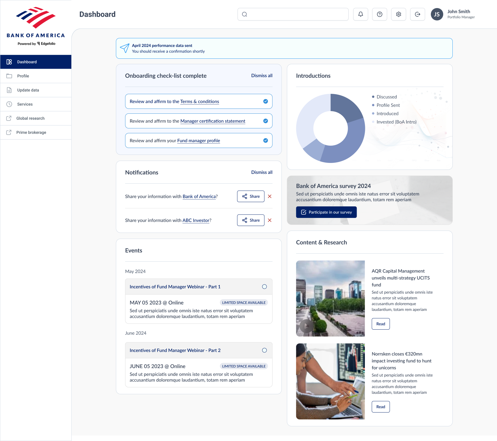
Landing dashboard
Redesigned the fund-manager landing experience, the first screen every user lands on, to make the most relevant signals legible at a glance, with a clear hierarchy for activity, performance and next-best actions.
Data visualization
Designed patterns for surfacing fund performance, engagement and pipeline data. Honest defaults, readable small multiples and interactions that let analysts interrogate the numbers without losing the plot.
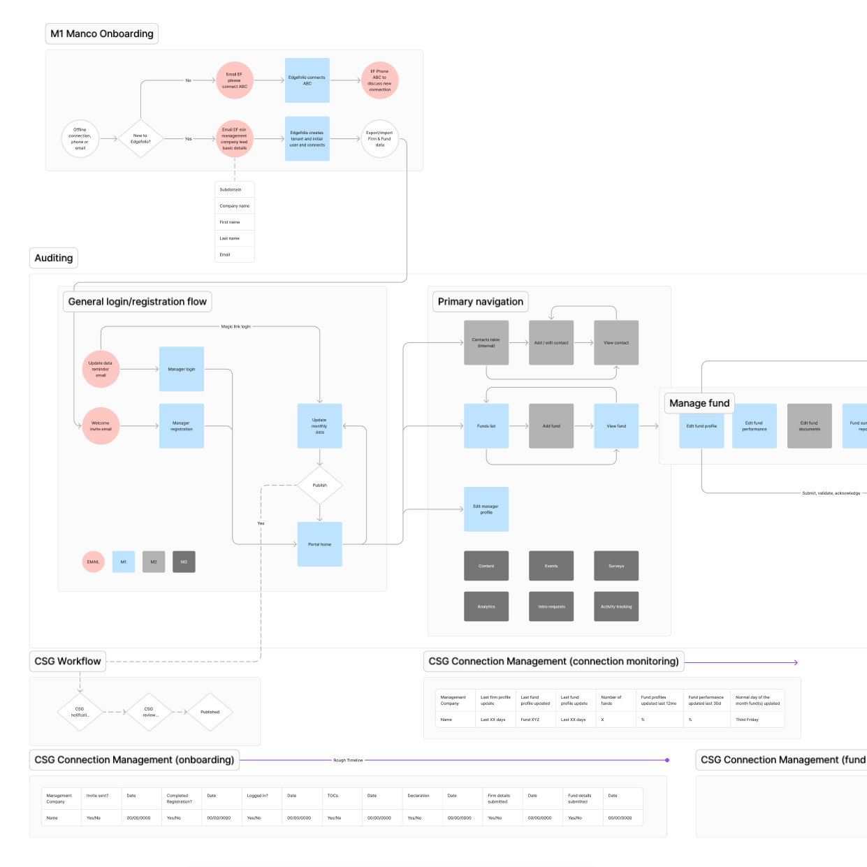
Service mapping
Mapped how the fund-manager front-end, back-admin tooling and the data pipelines in between actually connected, turning a lot of tribal knowledge into a shared picture we could design, plan and prioritise against.
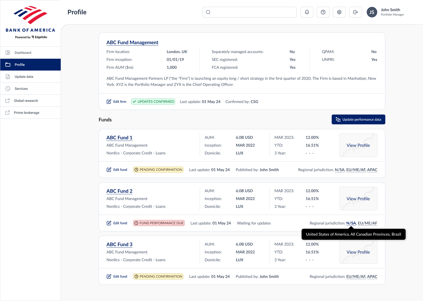
Invested funds view
Shaped the invested-funds overview and management screens, giving fund managers a single place to see, compare and act on the state of their book without bouncing between disconnected views.
Outcome
Takeaway
Dashboards got quieter and more useful, the data story got tighter, and the tooling behind the scenes stopped feeling like a separate product. Fund managers spent less time hunting and more time making decisions.
It was a sharp reminder that fintech UX lives or dies on restraint. The interesting work is often picking what not to show, and making the rest completely unambiguous.